
The Challenge
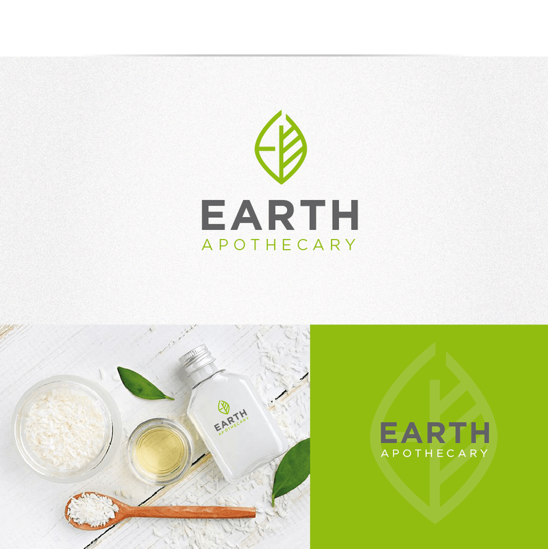
Client needed a logo that conveyed natural, organic, and eco-friendly values while looking premium enough for retail skincare shelves.
Our Approach
- Used a leaf-based icon to reinforce natural/organic branding
- Chose soft green tones for an earthy, wellness-focused palette
- Designed clean, minimal typography for a premium apothecary feel
- Ensured logo worked well across packaging and digital branding
The Result
- Delivered a cohesive, nature-driven brand identity
- Logo translated well onto product packaging design
- Strong client satisfaction with premium, organic aesthetic