
The Challenge
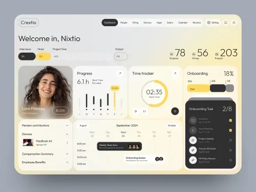
Client needed a dashboard that felt personal and motivating while clearly displaying multiple productivity metrics.
Our Approach
- Used soft yellow/cream tones for a warm, approachable feel
- Personalized greeting (“Welcome, Nixfio”) for user engagement
- Combined progress rings, charts, and stat cards for data variety
- Balanced dense information with clean visual hierarchy
The Result
- Delivered a personalized, easy-to-navigate productivity dashboard
- Strong visual variety improved data comprehension
- Warm aesthetic increased user engagement appeal